About
Aptum, with over 25 years of experience building IT infrastructure from the ground up, positions itself as a trusted partner in helping clients cut through complexity to achieve clarity and progress. Their brand emphasizes resilience, tradition, and the skilled trade of technology—values rooted in their role as engaged, present partners offering tailored solutions.
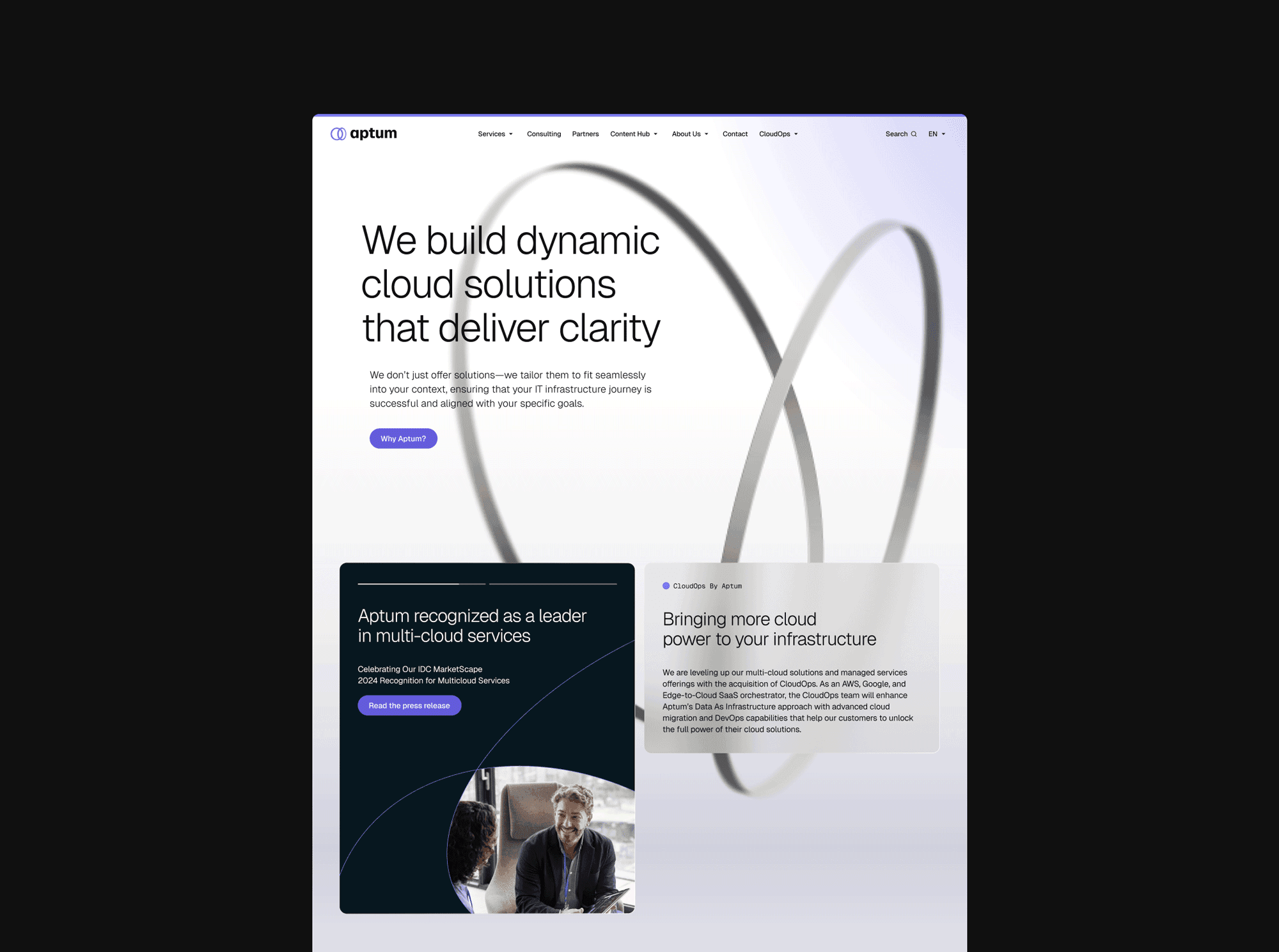
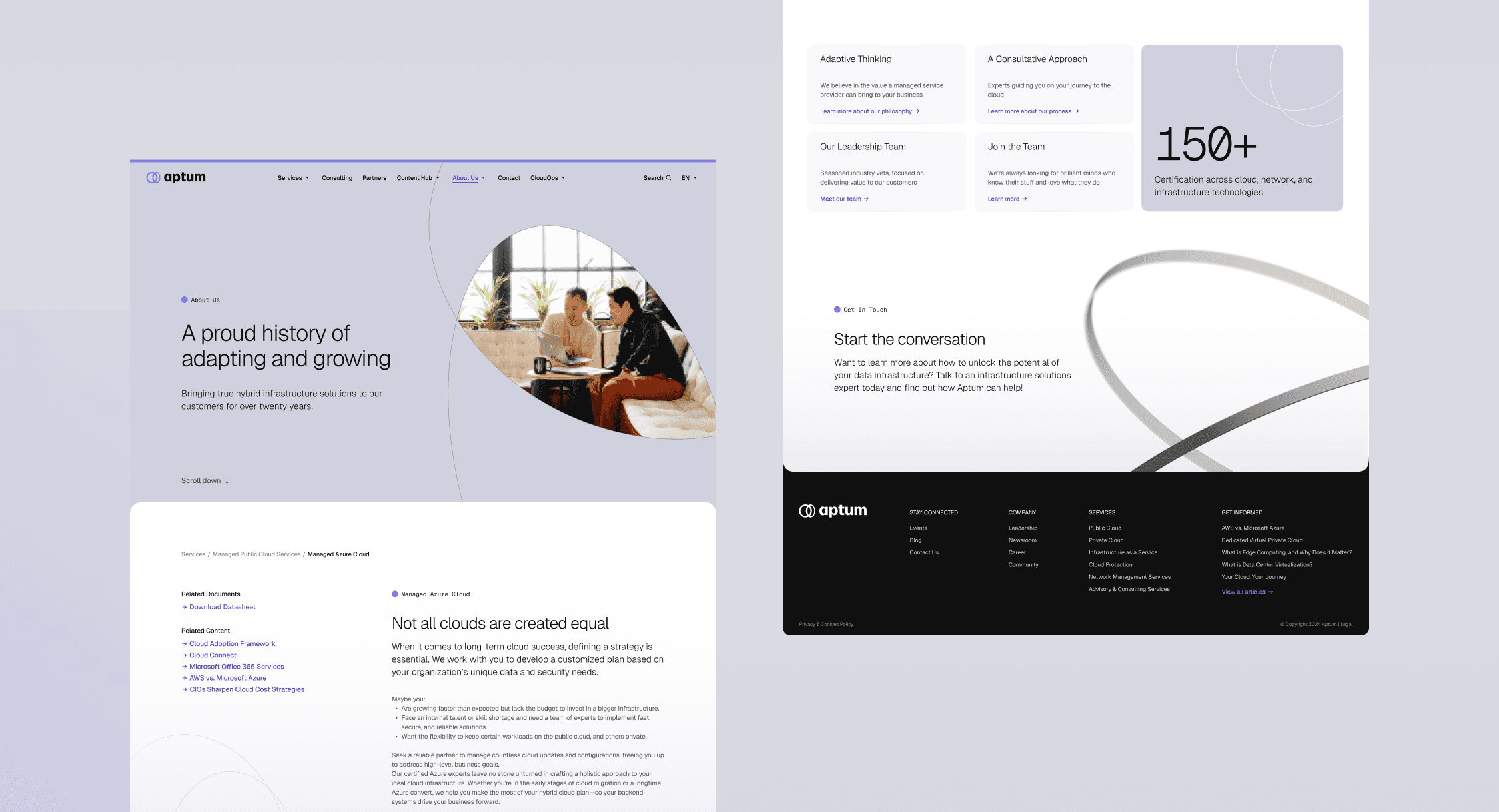
The challenge was to refresh their website’s UI to align with this updated brand identity while preserving the existing structure and user experience. The goal was to visually communicate Aptum’s promise of clarity and progress, creating a design that reflects their commitment to helping customers navigate the chaos of IT with confidence.
Process
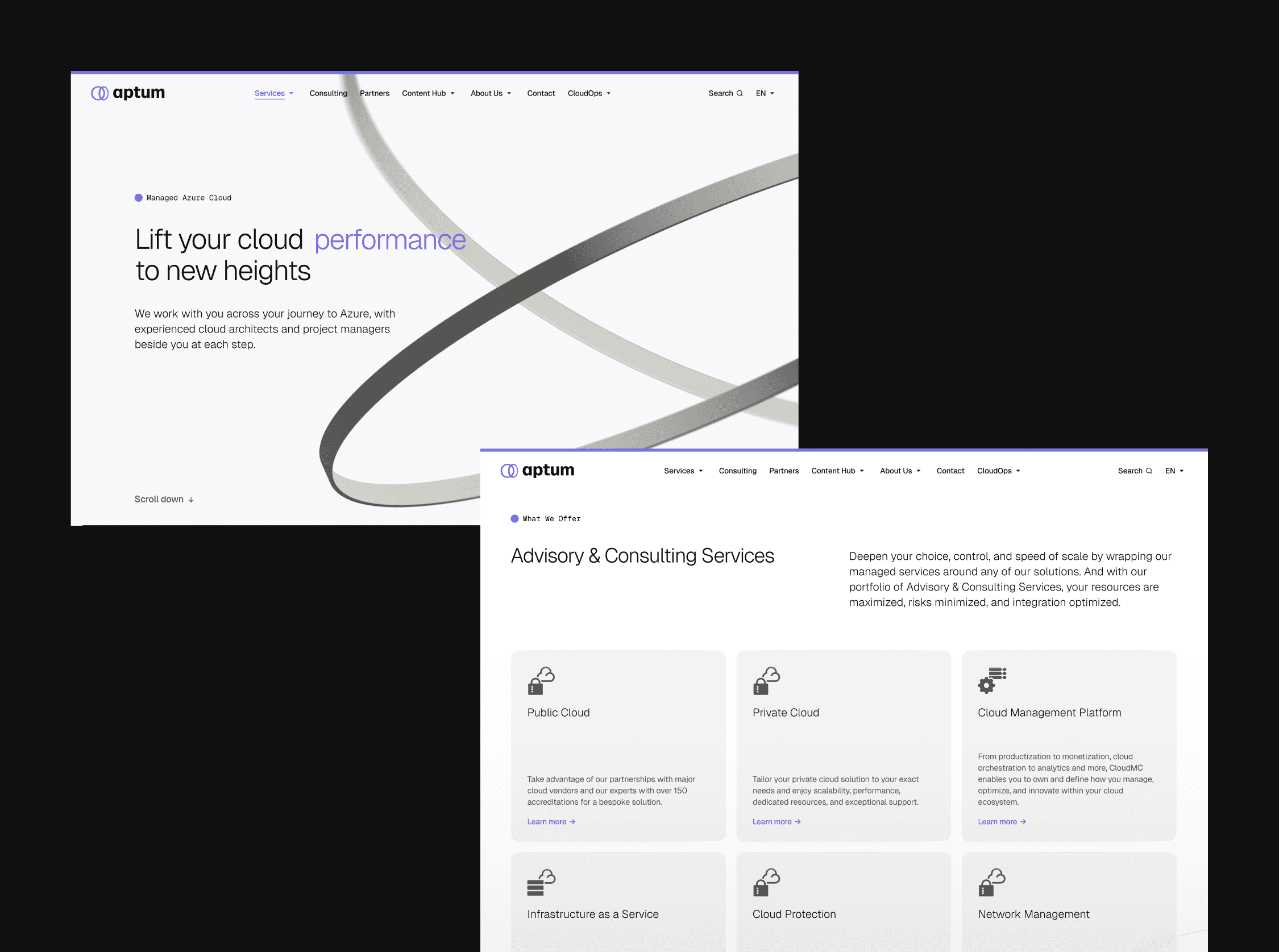
The redesign process prioritized visual alignment with Aptum’s updated branding while working within the constraints of the existing framework. A detailed side-by-side comparison of the current site and brand guidelines informed decisions, ensuring the structure and user flows remained intact.
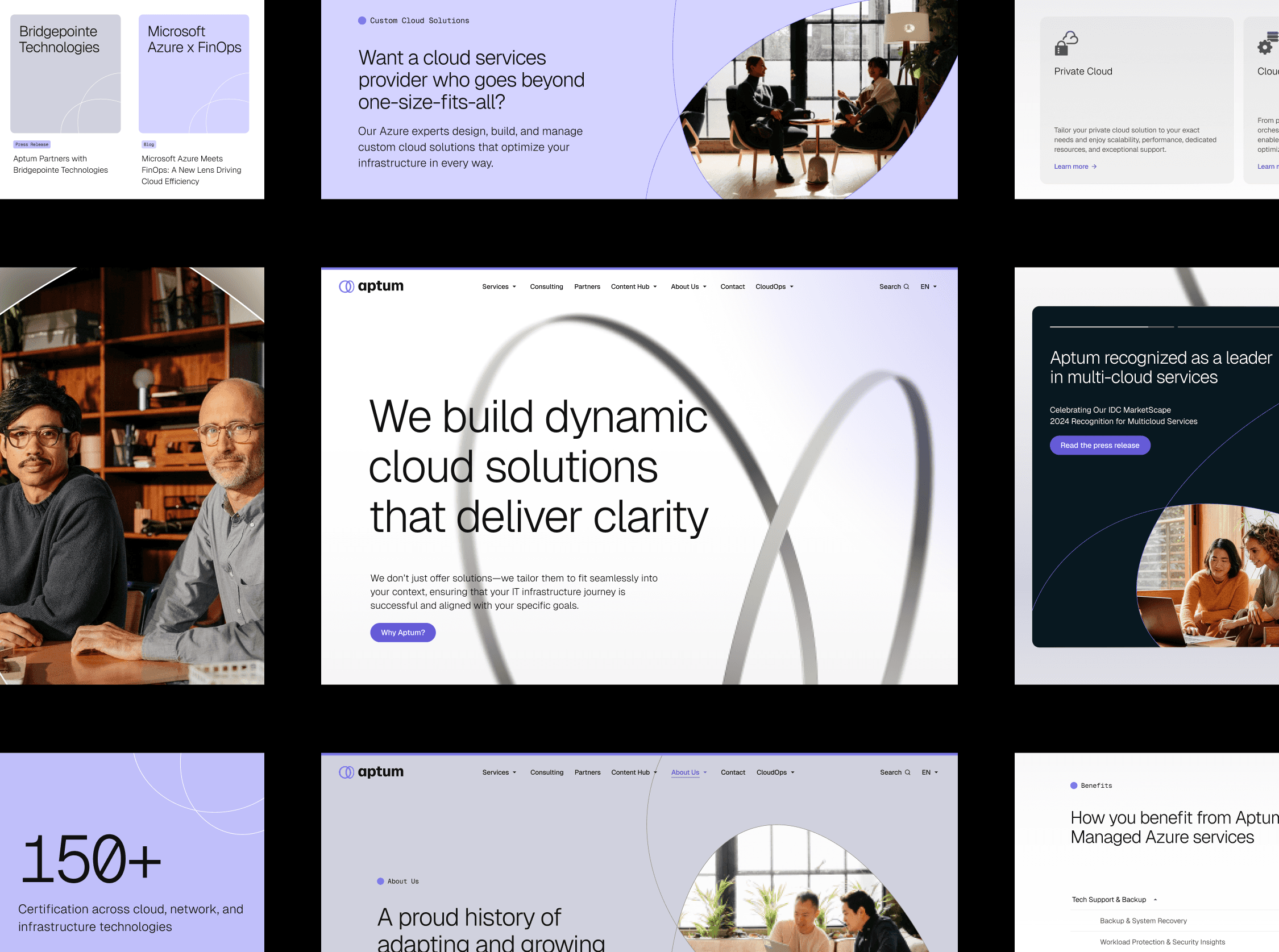
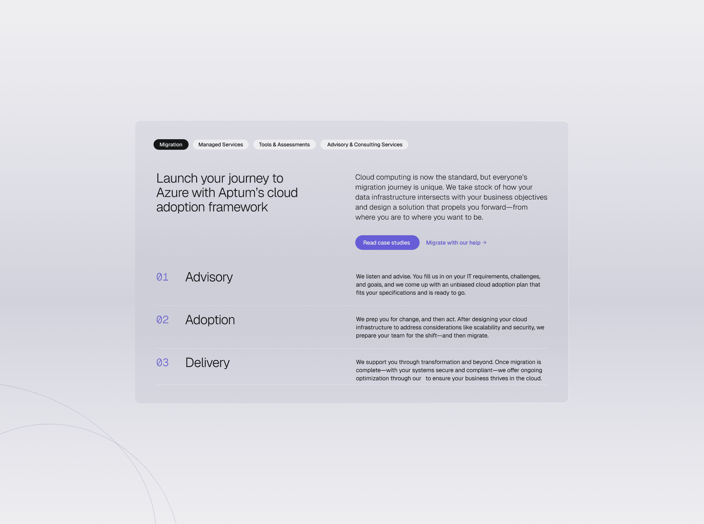
The visual refresh focused on introducing clean typography, an updated color palette, and customized iconography to elevate the interface. Modular design components were created to provide flexibility, allowing the in-house team to implement changes independently while maintaining consistency.
Key Takeaways
The project successfully translated Aptum’s new brand identity into a cohesive digital format, updating the UI on key pages to reflect the company’s commitment to clarity, progress, and innovation.
In addition to the redesign, a comprehensive UI kit was delivered to the in-house team, empowering them to roll out the refreshed design across the website with consistency and scalability. This provided Aptum with a strong, adaptable foundation for their digital presence, ensuring alignment with their brand ethos and supporting future growth.
Outcomes
In this project, we were approached by a startup called "Green Wave" to develop a brand identity that reflected their commitment to sustainability and environmental conservation.
All Works
