About
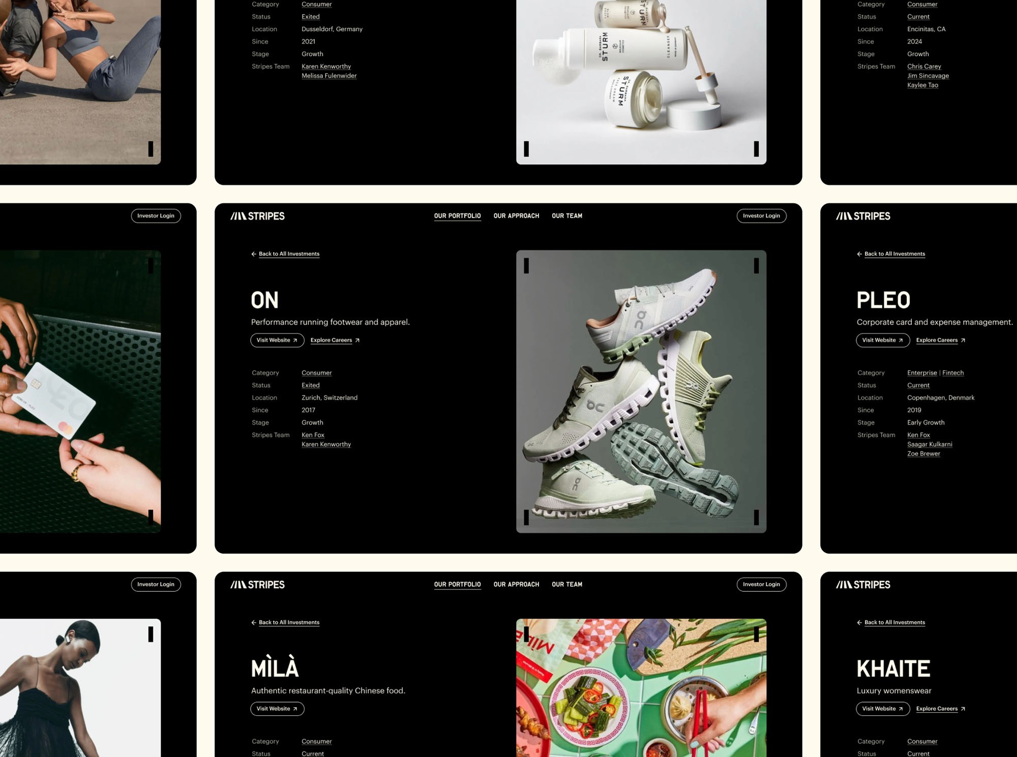
The primary objective for the new Stripes website was to make a strong first impression by showcasing their investments in top-tier software and consumer brands and emphasize their distinctive approach.
The original site posed several challenges: complex navigation, excessive content, and inconsistent interactive behaviors, which collectively contributed to high bounce rates.
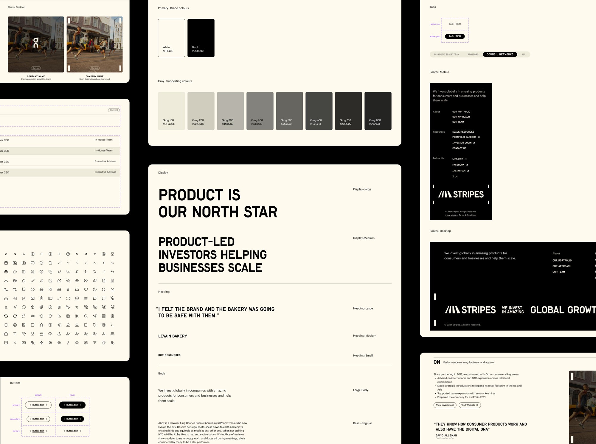
The redesign aimed to enhance navigation, refine information hierarchy, and create a cohesive user experience while integrating a new brand identity.
Process
The process began with a detailed audit of the existing site, supported by analytics reviews and behavioral data such as scroll and click maps. These insights informed a restructured sitemap, the removal of redundant content, and the consolidation of low-traffic pages into a unified "Our Approach" section.
Wireframes were developed to explore and validate new website flows and information architecture, ensuring the proposed structure effectively aligned with user needs and project goals.
Content was refined for clarity and relevance, targeting potential founders. A hierarchical layout was introduced to prioritize critical information, while interactive features, including hover effects and carousels, integrated the brand’s stripe motif to enhance engagement and reinforce visual identity.
Key Takeaways
The redesigned website featured an immersive homepage with a hero carousel showcasing key investments, effectively communicating Stripes’ value proposition within the initial viewport. Interactive elements, including hover effects and animations, seamlessly integrated the brand’s signature stripe motif, reinforcing visual identity while ensuring a consistent user experience. Strategically placed CTAs provided clear pathways for users to explore investments, delve into Stripes’ approach, and connect with the team, driving engagement through intentional design.
All Works


